About Mark Seeberg

I served as the student trainer of Notre Dame University's men's basketball team during the Austin Carr era, 1967-71 and coached high school basketball in the Chicago Catholic League at Loyola Academy for nearly twenty years.

60/40 & An Occasional Championship

In our recent series of posts, we learned that modern analytics provides descriptors or language in the form of numbers to represent what happens in a basketball game. 

On the basis of those numbers, we’re able to evaluate or measure the quality of play, demonstrating how well or poorly a team performed compared to its opponent… and in ways often more revealing than what the final score alone might suggest. In fact, as the data accumulates over a series of games, it exposes a team’s tendencies in such fine detail that we can forecast or reasonably guess the likely outcome of its future games. 

But no matter how insightful, the numbers never tell the whole story. 

At best, the computations remain an approximation of reality — a mathematical reduction of the lived experience that sometimes misses or even distorts the larger context of how and why things happened the way they did.

In fact, in last week’s post, we argued that the old-fashioned “eye test” may work better than the math as it detects the nuances and context that the numbers often miss. 

Not convinced? Let’s take a different tack.

By total coincidence, sixty years ago when Loyola Chicago defeated Cincinnati in the ‘63 national championship we’ve been exploring, I first learned what a school president said to his struggling athletic staff.  It’s stuck with me ever since. 

“60/40 and an occasional championship.”

That’s what he told them. 

Play a competitive schedule, win 60% of your games and an occasional championship, and you’ve achieved athletic excellence. 

Run the history of college basketball through that prism and some interesting patterns emerge.

Start with a self-evident fact we seldom acknowledge: on any given night, 100% of time, one team and its coach will lose. Every night of competition, half the participants lose. There aren’t any ties. There’s one winner and one loser, every game played. 

Last season, there were 6,159 basketball games played in Division I, pitting teams of varying ability under a variety of circumstances. Teams that had horrible shooting nights or lost their best players to injury, family deaths or tragic accidents; players whose girlfriends had dumped them; coaches whose careers were on the lines; teams that shot the lights out and won their conference championship or a holiday tournament; Cinderellas who upset better squads in the NCAA tourney only to lose in the next round; teams and coaches who fought their way to the Final Four.

Whatever the myriad of reasons, though, 50% of the teams and coaches who competed in those games found themselves on the losing end… 6,159 times. 

So, if over the course of a career, you manage to win 60% or more of your games, you join a very small and unique club. And very often, it has little or nothing to do with analytic efficiency.

The popular website sports-reference.com tracks the performance of 490 college basketball teams, spanning 132 seasons from 1893 to the current season of 2023-24. Presently, the NCAA recognizes 363 of these colleges as Division I members: 351 of them are eligible for this season’s NCAA tournament; 11 are currently ineligible because they’re transitioning from Divisions II and III.

Of the 490 schools, 403 have competed in ten or more seasons. (I’m not including the current, incomplete season.) 

Only 81 of them have won 60% or more of their games. Here’s a breakdown based on the number of seasons in which they’ve played:

Surprised to see the following schools on the list?

And when we compare the 81 with their 322 competitors whose winning percentages fell below 60%, it looks like this:

Narrowing our selection to the 363 teams that competed last season, 2022-23, only 54 of them won 60% or more of their games. Every other school – 85% of them — either lost more games than they won, or split their victories with losses.

Winning is not easy. For most teams, it’s a crap shoot. Winning 60% or more of your games over a sustained period of time is extraordinary.

What about the “occasional championship”?  

I mentioned that we have historic data on 490 schools since the first official season of college competition 132 seasons ago. Over the years, the number of these schools eligible for invitations to the NCAA tournament and the number of actual participants has varied dramatically for a host of reasons. 

For example, during the tournament’s first year – 1938-39 – three different champions were crowned by three different associations: the NCAA, the NIT, and the NY Sports Writers. 161 schools were eligible for the NCAA tourney that year but only 8 received bids, representing eight geographic regions or “districts” that the NCAA had established. Villanova, Brown, Ohio State, Wake Forest, Texas, Oregon, Utah State, and Oklahoma were invited, while Long Island University led by legionary coach and future novelist of the Chip Hilton series, Clair Bee, beat out five other schools in that year’s NIT. 

In the years that followed, the three post season tournaments eventually collapsed to two as the NY Sports Writers event fell by the wayside. The NIT continued to battle the NCAA for prominence even as the NCAA  gradually tinkered with its brackets and increased the number of participants. 

In the 1951, the NCAA tourney expanded to 16 teams and two seasons later, to 22. For the next two decades, the number of participants hovered between 22 and 25, and the NIT slowly declined in stature. By 1975, the NCAA had swelled to 32 teams and nine years later to 64. Finally, in 2011 the NCAA completed its evolution with 68 participants, regional seeding and pods to spread the talent evenly, and an 8-team, play-in or “first four,” leading to the 64-team, single elimination extravaganza we have today.

Regardless of the number of participants and how the brackets were arranged over the years, the tournament has always produced a “final four” – four survivors of the single elimination competition who pair up in semi-final matches culminating in the championship game. 

Since that first tournament in 1938-39, there have been 84 Final Fours. (85 seasons in total but the 2019-20 tournament was cancelled because of the Covid pandemic). 

84 Final Fours means that there have been 336 available spots for the last weekend of competition, yet a very small number of schools – 101 to be exact – filled those spots. In fact, a mere ten of those schools account for 137 or 41% of the spots. 

Add five more to the list and you discover that 15 schools own 58 of the 84 championships and 168 or 50% of the Final Four appearances.

Then, mentally round out the list with the “next best” five performers and…

we arrive at 20 schools that account for 194 or 58% of the available 336 spots … and collectively have won an incredible 73% of the 84 possible championships.

When we shift our perspective from great teams to great coaches, the same pattern emerges. 

Beginning in 1895 and extending through 2022-23, our last complete season, there have been 3,794 head coaches in college basketball, ranging in tenure from one season to forty-eight. Phog Allen leads the pack with 48 years at the helm – all at Kansas – while 780 coaches served no more than one season.

If we reclassify this list by winning percentage, one-fourth of the coaches make the 60% and higher category.

But if we overlay their years of tenure and examine only those who coached ten or more seasons, the list narrows significantly. Only 31% emerge as members of our “60/40” club.

Focus on those who coached 20 or more years and the list holds no surprises. 

And, then, there are those who don’t make the top 20 but are pretty prominent coaches. Here’s a representative list:

Keep descending through the coaching ranks to those with many victories but not enough to merit “60/40” recognition and you find prominent names like these:

Finally, consider coaches who have dominated the Final Four. Since its inception in 1939,  a small cohort of 20 men own nearly 60% of the championships and 40% of the appearances… all of them with career winning percentages of 60% or greater. Unsurprising, they align pretty closely with our list of frequent Final Four teams.

The mantra, 60 – 40 and an occasional championship, is both revealing and compelling, demonstrating that the margin between consistent winning and losing is, indeed, very small. 

If over the decades, the same schools and coaches consistently out-performed the competition, then many of their victories necessarily occurred before today’s era of advanced analytics even took hold. The same schools and coaches were apparently doing something right in the years predating analytics, as well as after. 

What, then, is the value of advanced analytics?

Do analytics merely reflect or mirror the results of doing the “right things” or does the data identify strategies for others to emulate… or a bit of both?

• With or without analytics, why do so few schools and coaches reach the “60/40” plateau? What role does sheer talent play? Last season, three newcomers appeared in the Final Four —   San Diego State, Florida Atlantic, and Miami — yet none of them had loads of “recognized” talent according to the recruiting services. They were a mixture of older kids, transfers, and diamonds-in-the-rough that the blue blood programs had missed. Yet, in the end, the only true blue blood in the field took home the trophy. As Connecticut’s coach Dan Hurley said, “This isn’t that hard. I have three NBA players and we put the right pieces around them.” What role might analytics play in “managing” the talent that you do have? 

• Shortly before his tipoff in last season’s SEC conference finals against Alabama, Buzz Williams, Texas A&M’s coach, talked about the need to contain Alabama’s fast-paced tempo; that 86% of the time, they shot the ball in the first 12 seconds of their possessions. But how is the precision of this statistic helpful? Does it reveal anything “operative” as to how Texas A&M might respond beyond what a simple eye test would have suggested? Alabama plays fast. If Alabama fired in the first 10 seconds or the first 14 seconds of their possessions, 75% instead of 85% of the time, would it change Williams’ response? What is the point of diminishing return in knowing such precise data?

• Speaking of Alabama, can strict adherence or even blind obedience to data hurt a team? Since his arrival in Tuscaloosa in 2019, Nate Oats has built a highly talented roster and taken them to the NCAA tournament three seasons in a row. From the beginning, he has enthusiastically preached a fast-paced, high scoring strategy that religiously ignores midrange jumpers in favor of more efficient 3-pointers and shots at the rim. Yet Alabama has been bounced unceremoniously from the tournament each year, including last March when they were the overall #1 seed. In ‘21, as a 2-seed, they lost to 11-seed UCLA; in ’22 as a 6-seed to 11-seed Notre Dame; and then last year, upset by 5-seed San Diego State. In those three loses they fired 39% of their shot attempts from 3-point range and shot a dismal 22.7%…. including 3 for 27 last year ….Is there a lesson here?

• Analyst Seth Partnow points out that generally speaking, the worst team in the NBA starts every game with a statistical baseline: 80 points, 25 rebounds, and 10 assists. In other words, if you’re good enough to play in the NBA, a team comprised of such players is going to start each game with this baseline in place. The worst team comprised of the worst players in the league is going to make some shots and free throws, probably enough to score at least 80 points, and pick up 25 rebounds and 10 assists in the process. What is the baseline for college basketball? And what are the marginal differences between the baseline and the game’s consistent winners?

These are just some of the questions I wish to explore in the weeks ahead. 

The Eye Test Still Works

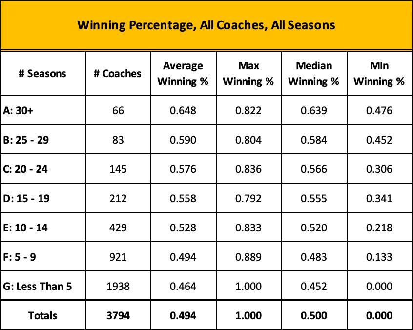
As we saw in our last post, Speed Kills, modern analytics often misses the big picture.

Just like the data revealed in a traditional box score, today’s enhanced efficiency stats remain only an approximation of reality, a representation that never fully captures the entirety or whole of what takes place in a basketball game. 

Moreover, in its zeal to eliminate the bias or tempo from its representation, advanced analytics unintentionally hides or masks the operational pace of play – the relative rate of speed or intensity at which things occur during each team’s possessions. 

Instead, analytics harmonizes or levels out the mathematical differences of each team’s pace of play by counting the game’s possessions in a particular way. Because a shot attempt followed by an offensive rebound is tallied – not as a new possession – but as the continuation of the current one, each team ends up with the same or about the same number of possessions.

Team A advances up the floor and attempts to score, followed by Team B making its own attempt. In this manner, the teams “take turns,” alternating possessions until the game clock expires and one team has scored more points than the other. This makes it easy to measure the outcome of each possession, identifying which team got the most out of its respective turns with the ball.

For example, in a game of 130 possessions, 65 a piece, if Team A scored 80 points to Team B’s 70, Team A not only won the game, on a possession-by-possession basis, it performed more efficiently, producing an average of 1.23 points each time it had the ball while Team B yielded slightly less, at 1.07. A suite of additional efficiency stats flows naturally from this statistical baseline, offering insight into Team A and B’s respective performances – offensive rebounding ratio, effective shooting percentage, turnover rate, and the like. 

In all, though, the flesh and blood, real or actual pace of the game is artificially constrained so that the faster or slower tempo of the either team does not skew the mathematical outcome of the comparison. 

The fact that one team approaches the game in a risk-adverse, slow and deliberate manner while its opponent gambles with a full-court, trapping defense, denies every passing lane in the half court, runs the ball up the floor to generate quicker shots, and when it misses, rebounds furiously to garner additional shot attempts, is ignored in the data. 

And yet, those stylistic differences often separate victory from defeat, at times rendering today’s efficiency stats irrelevant, if not meaningless.

We saw this in our exploration of the 1963 NCAA championship game when Loyola Chicago overcame a dismal 30% shooting performance and a 15-point deficit to win the national title. Even though both teams enjoyed roughly the same number of possessions and from an analytic standpoint, competed at the same rate of tempo, the Ramblers generated 30 more scoring opportunities than their “more efficient” opponent.

But here’s the rub. 

While today’s efficiency stats often mask the stylistic differences that distinguish a game’s true, operational pace, the human eye detects them immediately… perhaps not in fine detail, but the general gist of what was occurring in real time.

In the case of the Loyola – Cincinnati contest, a simple eye test revealed all you needed to know: one team stopped shooting while the other continued to fire away; one team committed turnovers while the other seldom lost the ball even though it played at more frenetic pace.

Even casual fans sitting in Louisville’s Freedom Hall that night or watching the game on television could easily grasp what was happening. They didn’t need traditional stats, let alone today’s enhanced ones to comprehend that Loyola was struggling but fearlessly competing to win while Cincy was trying not to lose. Imagine a discussion between two fans sitting side-by-side in the arena:

“Loyola seems to be getting a lot of second shots… they’re not making many but they keep trying.”

“Yeh… and on defense they keep pressing. They’re frustrated and maybe a bit desperate but they’re not quitting.”

“Bonham’s playing a great game… seems to make every shot he takes… but I haven’t seen him take a shot in a long time… and what’s the deal with the Harkness kid? The game’s almost over and I don’t he’s made a shot yet.”

“How many more times is Cincinnati going to throw the ball away? 

“Cincy may have started their stall too early… they’re playing the clock instead of playing Loyola and the Chicago kids are catching up.”

There’s a lesson here. The eye test still works.

Human beings are learning machines. Our senses, especially the eyes, process the world around us. To make sense of what we experience, we look for similarities, placing random, discrete observations into mental categories. We put “like” things together – shapes, sizes, causes, effects, events, etc. – seeking patterns or connections between them, and drawing conclusions or inferences about what we have seen. The process is inductive, moving from specific observations to general theories or broad concepts. That’s how we learn.

In basketball, when a team takes possession of the ball, there are really only five things that can happen. In other words, in the course of a game, every one of a team’s possessions will fall into one of the following general categories:

• Team A shoots and scores 

• Team A shoots and misses 

• Team A is fouled, inbounds the ball and starts again, or is awarded one or more free throws 

• Team A turns the ball over, losing possession before it has a chance to score 

• Team A shoots and misses but rebounds the ball to continue the possession and get another chance to score.

At the end of each, Team B takes its own turn with the ball and repeats one of the five categories. 

A spectator isn’t likely to record these possession types or even be conscious of them, but if you showed him the list and answered a few obvious questions – “Where do you place jump balls?” – he’d likely say, “Yeh… okay, I get it. That pretty much describes what happens in any game.”

He wouldn’t need access to stats or knowledge of modern analytics to know this. The categories are self-evident and as he experiences them in real time, he forms conclusions about the style, quality, and pace of play as the game unfolds. Later on, the game stats may confirm or qualify or in some way sharpen what he has seen, but they’ll seldom replace what his eyes have already told him.

The neat thing about film, of course, is that it extends the eye.

With the help of Loyola University, I got hold of an old VHS copy of the ’63 championship game and digitized it. Understandably, it was granny, a bit jumpy in parts, the narration not always in synch with video, yet very revealing. 

The first thing I did was to compose a play-by-play log of the game – a brief set of notes outlining what happened each time the ball changed possession. Basic things: who shot, was it made or missed, an errant pass and turnover, an offensive rebound and another field goal attempt, and the like. 

If the camera happened to settle on the game clock or the t.v. announcer noted the time, I recorded those in my play log. And by re-watching film and noting the time lapse count on my computer, I was able to compute and note additional game times for particular exchanges that I felt were important. 

The ability to replay portions of the game as often as I wanted meant that I could keep refining my play log until I was sure that I had an accurate account of the game. Unlike the sportswriters and sports information directors who surely created their own logs from the sideline sixty years ago, I had an opportunity to sharpen what my eyes were telling me. How many tips did that kid just attempt? Did someone else get their hands on the ball or does the kid get credit for each of them?

Initially, aside from possession counts for each team, I didn’t attempt any kind of statistical analysis or make any value judgements about what I was seeing and recording. Only after I had transferred my log to an Excel spreadsheet did I run counts of the typical data points found in a traditional box score – the number of field goal attempts and makes, offensive and defensive rebounds, turnovers, and the like.

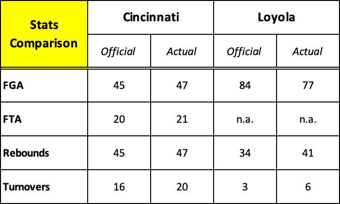
I quickly discovered that the official statistical record of the game found on the NCAA website and sports-reference.com, and widely reported in numerous newspapers and several books over the last sixty years is flawed. 

And, then the plot thickened.

Armed with my play-by-play in Excel format, I “tagged” each possession with one of the five “possession types” described above and ran simple counts to see if such groupings or categories might provide insight to the game’s outcome. 

Keep in mind that there’s nothing special about these possession categories. As noted above, they’re just simple groupings of “like things” that comprise a basketball game, organizing what the eye has naturally seen: a shot is taken and made, a shot is taken and missed, and so forth. There’s no deep dive into math… no attempt to calculate and compare one team’s “efficiency” score with its opponent. Just simple counts of key actions that occurred in each category. 

Effectively, instead of reviewing a game’s possessions in specific time periods – quarters or halves – the five “type” categories provide a way to reexamine the game based on the similarity of actions that made up each possession. In either case, the totals at the bottom of each chart are the same… exactly what you’d expect to find in an old-fashioned box score.  

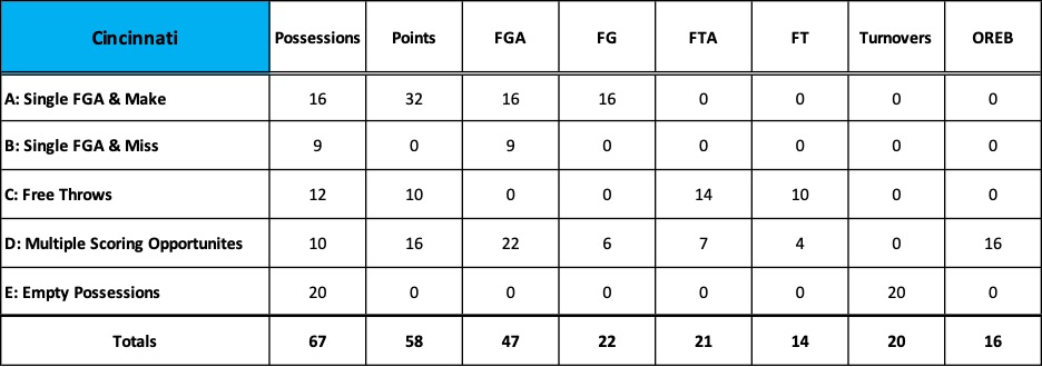
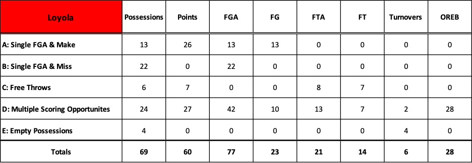
Here’s Cincinnati’s breakdown followed by Loyola’s.

Two categories – B and E – jump out immediately. 

• B: Single FGA & Miss: Loyola had 22 possessions in which they attempted a single field goal and missed, while Cincy had only 9. In other words, 32% of Loyola’s possessions generated a shot attempt, but no points. This category is indicative of Loyola’s inefficiency throughout the game. Lots of shot attempts but few baskets. 

• E: Empty Possessions: 20 times or 30% of its 67 possessions, Cincinnati threw the ball away and with it, any chance to score. Clearly, Loyola’s pesky defense helped compensate for the team’s horrible shooting night. Moreover, Cincy’s turnovers immediately triggered Loyola possessions in which they attempted 21 field goals, 7 free throws, and scored 17 points. Inefficient shooting, to be sure, but numerous scoring opportunities that Cincy gave away. 

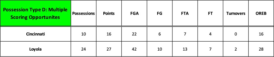
But most telling of all is category D: Multiple Scoring Opportunities. This possession type features an initial shot attempt followed by an offensive rebound, leading to additional scoring opportunities within the same possession. The differences here are startingly. 

In 35% of its possessions, Loyola snagged 28 offensive rebounds and generated 42 field goal attempts, nearly equaling Cincinnati’s FGA totals for the entire game. Along with free throws, Loyola scored almost half its total points in just those 24 possessions. 

Coupled with category E: Empty Possessions, the counts in this possession type reveal the true operational pace of the game. They confirm what the eye immediately grasped: Loyola’s aggressive offensive rebounding and tenacious, disruptive defense produced numerous scoring opportunities that overcame a horrific, inefficient shooting performance. Loyola played at a pace that generated 30 more field goal attempts than Cincinnati and needed only to convert one of those “extra” attempts to win the game.

The eye test and the intuitive leaps it stimulates is often more revealing than statistical analysis because it provides important context.

The ’63 championship game is a dramatic example of the inherent limits of data. My attempt to demonstrate this by zeroing in on a single game does not refute the potency of analytics, but to question our contemporary fascination and sometimes rigid allegiance to it.

Over the course of a season or a series of games, advanced analytics can help us evaluate performance and set quantifiable team goals; it can provide valuable insights to help players improve “on the margins,” but the larger context it so often misses is important, too. Often times, more important.

Imagine a single shot that misses and is rebounded by the defense. From an efficiency standpoint, the possession failed, but did the offensive scheme you designed produce the shot you wanted? Did the right player attempt the shot from the right location and under the right circumstances? If so, then your scheme was well-conceived even though the result was a miss and the possession deemed “inefficient.” A coach can’t dictate outcomes. All he can do is arrange the pieces intended to create the shot he desires; the shot goes in or it doesn’t, but a miss doesn’t necessarily mean his team “ran bad offense.” 

This post and the two that preceded it, as well as several more I’ll drop in the weeks ahead, are really about widening the lens… achieving a broader perspective.

Are there other ways to measure performance that may be more revealing than efficiency measurements and comparisons? If analytic data falls short of our expectations, does a solution lie elsewhere? Is there a different, more convincing barometer of performance and predictor of future success? 

Stay tuned.

Speed Kills

It seems unnecessary, even silly to say it, but basketball is a very simple game. Ever since the late 1930s when the college rules committee eliminated the mandatory center jump after every score, the game became one of transition, the competitors converting from offense to defense and back again in near seamless fashion. 

Essentially the game requires you to trade possessions and attempt to score when it’s your turn. You win by outscoring your opponent as the possessions unfold, one after another. It’s a  possession-by-possession game.

Modern analytics and the effort to determine how best to measure a team’s performance finds its origins this understanding.  

Like many insights, a number of people likely came to the same conclusion in different places, under different circumstances, so it’s hard to say who gets credit or took the first steps. But conventional wisdom cites the work of a young Air Force Academy assistant who questioned the accuracy of using traditional stats like points per game to measure a team’s offensive and defensive efficiency.

Dean Smith had majored in mathematics at Kansas while playing for the legendary ­­­­­­­Phog Allen and claimed he would have been happy to have become a high school math teacher, but in 1955 head coach Bob Spear offered him a job at the newly opened Academy.

In his role as Spear’s assistant, Smith began to probe the possession-by-possession nature of the game and reasoned that a game’s tempo or the pace of play skewed statistical conclusions because teams played at different speeds.

“I have never felt it was possible to illustrate how well we were doing offensively based on the number of points we scored. The tempo of the game could limit us to fifty points and yet we could be playing great offense. In some games we might score eighty-five points and yet be playing poorly from an offensive viewpoint… From a defensive point of view, one of my pet peeves is to hear a team referred to as the ‘defensive champion’ strictly on the basis of giving up the fewest points per game over a season. Generally, a low-scoring game is attributable to a ball control offense rather than a sound, successful defense.”

To Smith, the only way to remove the bias of tempo was to accurately count each team’s possessions and ask “who made the most of the possessions they had?” By calculating how many points a team scored and allowed per possession, one could gain a clearer picture of how “efficient” a team had performed and compare it with other teams no matter whether they favored a slow tempo or a fast one. 

To that end, Smith devised a statistical tool he called “possession evaluation” and began measuring the Academy performance through its prism. Four years later, in 1959, while serving as an assistant for Frank McGuire at North Carolina, Smith described the system in McGuire’s book, Defensive Basketball. 

“Possession evaluation is determined by the average number of points scored in each possession of the ball by a team during the game. A perfect game from an offensive viewpoint would be an average of 2.00 points for each possession. The defensive game would result in holding the opponent to 0.00 (scoreless). How well we do offensively is determined by how closely we approach 2.00 points per possession. How close we come to holding the opponent to 0.00 points per possession (as opposed to holding down the opponent’s total score) determines the effectiveness of our defensive efforts. Our goals are to exceed .85 points per possession on offense and keep our opponents below .75 point per possession through our defensive efforts.” 

Four decades later, Smith’s pioneering work found its way into Dean Oliver’s 2004 breakthrough book on statistical analysis, Basketball on Paper, in which he outlined his now famous “four factors” of basketball efficiency.

Oliver took the three broad statistical categories we’ve always used to measure performance – shooting, rebounding, and turnovers – added some nuance by including free throws and offensive rebounds to his equations, calculated the per possession value of each, and then multiplied the resulting percentages by 100 to determine a team’s offensive and defensive efficiency ratings. For Oliver, a team that had a higher offensive rating (points scored per 100 possessions) than its defensive rating (points allowed per 100 possessions) was more efficient than an opponent with lower ratings and the likely winner of a game between the two. 

Combined with the onslaught of the three-pointer and its dramatic impact on coaching strategy, advanced analytics became a mainstay in sports journalism. You would be hard pressed to watch a game on television today or to read an account of it tomorrow without hearing references to one or more of Oliver’s descendants in the field – Ken Pomeroy, Kirk Goldsberry, Seth Partnow, Jordan Sperber, or Jeff Haley, to name a few. 

And it makes good sense. The data is fascinating and often insightful.

• Team A plays fast, averaging 85 points per game but from an efficiency perspective, barely a point per possession while its upcoming opponent, Team B, averages 1.2 points per trip down the floor. Can Team A force Team B into a running game in hopes of disrupting Team B’s preferred rhythm and offensive efficiency? Or might an adjustment in Team A’s defensive tactics push Team B deeper into the shot clock where the data reveals that their shooting percentage drops?

• In its last game, our opponent, Team C, had an excellent offensive efficiency rating of 1.20, averaging 79 points on 66 possessions, but turned the ball over 16 times. In the 50 possessions when they protected the ball, their efficiency rating jumped to 1.58. What can they do to cut down on turnovers in the season ahead and grow more efficient?

• Team D is a weak shooting team but a high volume of their shots are 3-point attempts. They make enough of them to offset their misses and keep the score tight. What can we do to either reduce the number of 3-pointers they take or further erode their shooting percentage?

But there’s a problem.

While data comparisons can be purified by eliminating tempo mathematicallythe game itself is not tempo-free.

Not tempo or pace narrowly defined as the number of possessions a team experiences in the course of a game, but the rate of speed or intensity at which things takes place during those possessions… or perhaps more precisely, the speed and intensity of a team’s actions relative to the speed and intensity of its opponents’ actions. 

What do the military boy say? Speed kills?

In this sense, tempo is a weapon as speed or intensity, or a combination of the two, can shatter an opponent’s cohesion, throw them off balance, confuse and disrupt their preferred rhythm, challenge their confidence. It often creates fatigue and doubt. For example, determined and aggressive offensive rebounding not only creates more scoring opportunities, it disheartens defenders who have worked hard to prevent easy shots, only to see their opponent get the ball back for another try. 

Basketball is filled with sweat and blood, and wild swings of emotion. Games run the gamut from stupid, unforced errors, missed shots, confusion and fatigue to gut-wrenching, scrambling defensive stands and exhilarating, fast-paced scoring runs … and moments of just plain luck. In combination, these can lead to what coaches call “game slippage” – a growing dread that your lead is slipping away and there is nothing you can do to stop it. 

It’s impossible for data, tempo-free or not, to fully capture or quantify such realities.

In his recent book, The Midrange Theory, NBA analyst Seth Partnow eloquently acknowledges this fact, citing the foundational principle of general semantics first outlined by linguist S.I. Hayakawa in 1939: The map is not the territory… the word is not the thing. 

A word or a symbol or a mathematical equation or even a lengthy written description is only a representation of reality… it’s never the reality itself, just as a map is not the territory it attempts to depict. No matter how nuanced and precise it becomes, advanced analytics can never capture the totality of the decisions, actions, and outcomes that comprise a basketball game. 

Today’s advanced, computer-generated analytics often miss the context, the circumstances, the “how and why” of what takes place on the court. 

The stats of the 1963 NCAA championship game between Loyola and Cincinnati that we introduced in our last post don’t explain why – after shooting 73% on 8 of 11 shots in the opening minutes of the second half – Cincy’s Ron Bonham and his teammates took only 3 more shots in the remaining 13 minutes of regulation and blew a 15-point lead. 

Nor do they explain how and why Bonham’s All-American counterpart on Loyola, senior captain Jerry Harkness, failed to make a single basket in the first 35 minutes of play, but then exploded. With 4:34 left in regulation, he scored his first field goal, followed ten seconds later by a steal and a second basket. At the 2:45 mark Harkness scored a third basket and with only four seconds left on the clock, connected on a 12’ jumper to tie the game and send it to overtime. On the opening tip of the overtime period, he scored his fifth and final field goal. 

In the course of 242 desperate seconds, Harkness scored 13 points on five field goals and three free throws, propelling Loyola to the national championship. His frenetic intensity on defense, coupled with mad dashes up the floor hoping to spark the Ramblers’ fast break, typified the Chicagoans’ up-tempo, less than efficient, but highly effective approach to the situation in which they found themselves.

Predictably, according to the conventions of advanced analytics, both teams had roughly the same number of possessions, 67 for Cincinnati, 69 for Loyola… an average of 68 apiece. As the game unfolded, they traded possessions, each taking their turn with the ball. But while this accounts for the relatively slow “mathematical” tempo or pace of the game, it masks the relative speed and intensity – the operational tempo – of what took place within those possessions. 

For example, in less than a third of its possessions, Loyola generated 42 field goal attempts, nearly equaling Cincinnati’s total output for the entire game. 

You won’t find those numbers revealed in the efficiency stats of the game.

Loyola was horribly inefficient but, in the end, effective because their rapid pace and intensity generated 30 more scoring opportunities: 77 field goal attempts to the Bearcats’ 47. Even in the overtime period, Loyola fired six more times than Cincy. They converted only 33% of them, half of  Cincinnati’s ­­­67% rate, but enough to give them one more basket as the clock expired.

The sheer volume or statistical raw count of Loyola’s attack confounds the tempo-free, efficiency percentages of the Four Factors. 

Analytics picks up the underlying drivers – Loyola’s offensive rebounding and tenacious defense leading to Cincy turnovers turned the game around – but assigns values based on percentages that are misleading.

Let’s start with key indicator of efficiency and likely victory in the both the NBA and college ranks, the eFG% or “effective field goal shooting percentage.” 

It’s calculated just like the traditional FG%: you divide a team’s “makes” by its “attempts” to determine its shooting percentage. For example, 20 baskets divided by 50 attempts yields a shooting percentage of 40%. But the modern efficiency calculation makes an important adjustment to the formula. Recognizing the impact of today’s 3-pointer, it grants 50% more credit for made 3-pointers. If 6 of those 20 baskets were 3-pointers, the efficiency calculation climbs from 40% to 46%. From an efficiency standpoint, it’s as if the team had made 23 two-point baskets instead of only 20.

Since there were no 3-pointers in 1963, the eFG% formula for Loyola and Cincinnati is no different than using the traditional version. Clearly, Loyola was horrendous, making only 30% of its 77 shots while Cincinnati scored a very respectful 47%. But, the sheer volume of Loyola’s attempts renders an efficiency comparison between the two meaningless. 

Cincy’s first, last, and total 47 attempts yielded 22 baskets… while Loyola’s first 47 attempts yielded only 12, putting them 20 points behind. But the Ramblers went on to attempt an additional 30 field goals… and made 11 of them, winning the game by 2. 

Comparing each team’s ORB% or offensive rebounding percentage leads to the same problem.

This measurement calculates the percent of offensive rebounds a team secures on its missed FG attempts. It’s an important indicator of offensive efficiency because an offensive rebound extends a possession, creating an opportunity for a second attempt to score more points. 

Once again, Cincy achieved higher efficiency rating than Loyola, snagging 55% of their offensive rebound opportunities compared to Loyola’s 47%. But Cincy’s advantage in the comparison is the “mathematical” consequence of attempting 30 fewer field goals. 

Loyola’s raw numbers tell us more about the actual pace, intensity, and outcome of play than the analytic scores do. 

In just 24 of its possessions, Loyola grabbed 28 ORBs and generated 42 FGAs, nearly as many as Cincy attempted in the entire game. The Bearcats outperformed Loyola in the ORB% factor but produced 12 fewer scoring opportunities and 11 fewer points. 

The efficiency factor called the FTA% captures a team’s ability generate free throws in proportion to the number of FGs it attempts. The idea is that free throws are statistically easy, highly efficient points to score because the shooter is unguarded, so a team with a higher FTA% than its opponent is likely the one that was more proficient in attacking the defense and getting to the line. In the modern game the FTA%  is increasingly relied upon to measure how much pressure a team or specific scorers exert on the defense.

Once again, the wide disparity in the number of field goal attempts between Loyola and Cincinnati makes the comparison irrelevant. Both teams attempted the same number of free throws and made the same number, 14 for 21. Cincinnati’s higher rating had nothing to do with the outcome of the game.

Next to shooting percentage, the most important indicator of offensive efficiency and likelihood of victory in the NBA and college ranks is the TO% or turnover rate. (On the high school level, many coaches believe that it is the most critical of the Four Factors.) 

The TO% tells us how well a team protected the ball by determining the percentage of its possessions that resulted in a turnover. Its importance makes sense because if you lose the ball, you may end up with an “empty possession” – one in which you lost the opportunity to score. 

In the Loyola – Cincinnati tilt, it is the only one of the Four Factors that demonstrates actual efficiency. Loyola turned the ball over 6 times in 69 possessions –  9% of the time – compared to Cincinnati’s horrendous 20 times or 30%. But the reality was even worse. 

That’s because two of Loyola’s turnovers occurred during possessions in which they rebounded missed FGAs and then lost the ball. In other words, these possessions were not “empty” as they attempted a field goal and only lost the ball after securing the offensive rebound. In Cincinnati’s case, all twenty turnovers resulted in empty possessions.  

Perhaps a clearer way to look at it is to compare the number of “true” or pure empty possessions. From this perspective, Loyola had chances to score in 94% of its possessions, not the 91% suggested by the TO% formula. Conversely, all twenty of Cincy’s turnovers resulted in an empty possession so they had chances to score in only 70% of their possessions.   

The 1963 NCAA championship is a dramatic example of how advanced analytics often misses the significant impact of operational tempo on the outcome of a game. 

Ironically, though Oliver and his fellow practitioners trace the origins of their work to Dean Smith’s “possession evaluation” in the 1950s, the underlying culprit may lie in how they departed from Smith’s definition of a possession and, more importantly, from his reasons for evaluating possessions in the first place.

Smith was interested in measuring his team’s efficiency regardless of the pace of the game. Comparing his team with his opponent did not require equalizing the number of each team’s possessions but looking, instead, at the per-possession performance of each team, given its particular pace or tempo. In other words, he didn’t strip tempo out of his calculations, he included it. 

In Smith’s world, a possession ended and a new one began as soon as a team lost “uninterrupted control of the basketball.” Throw the ball out of bounds and your possession ended; shoot the ball and whether you made it or missed it, your possession ended. And if you regained control of a missed free throw or field goal with an offensive rebound, you started a new possession, a new opportunity to score.

In Oliver’s world, an offensive rebound continues the same possession. You don’t get credit for an additional one. That’s why by game’s end both teams will tally the same or close to the same number of possessions and why modern analytics can perform a “tempo-free” comparison of each team’s efficiency.  

Smith wasn’t interested in making an exacting mathematical comparison of efficiency. Regardless of the game’s total number of possessions, whether the overall pace had been fast or slow, or whether one team had generated greater or fewer possessions than its opponent, he asked the same two questions: how many possessions or scoring opportunities did we create and how well did we perform in each of our possessions? 

We know for certainty that Dean Smith was in Freedom Hall the night Loyola beat Cincinnati for the national championship. We don’t know if he charted the game and ran the results through his efficiency formula, but if he did, here’s what it would have looked like compared to the numbers using Oliver’s formula.

The end results are the same; do the multiplication and Loyola wins by two, 60-58… but Smith’s method of counting possessions paints a clearer picture of the operational tempo of the game. 

Possession-by-possession, Loyola’s performance was woeful but in Smith’s view, they played at a faster pace, generating sixteen more possessions than Cincinnati. Couple Smith’s numbers with the game’s traditional stats and you get quick confirmation of what the average fan saw in the arena or on television that night: Loyola played terrible but shot more often, grabbed lots of rebounds when they missed leading to more shots, and rarely turned the ball over. They created more chances to score than Cincinnati did.

Smith’s method reminds us that pace or tempo as always been defined by the number of possessions but his simpler method of calculation – adding a team’s shot attempts, turnovers, and specific kinds of free throw attempts – comes closer to exposing the all-important but missing element of pace in today’s analytics – the passage of time. Consider the following:

Whose count gets us closer to the actual pace of the game? 

In 40 minutes of regulation play, Smith credits Loyola with 94 possessions to Cincy’s 83. Basically, every two minutes that passed off the game clock saw Loyola producing five scoring opportunities to Cincinnati’s four. When regulation time finally expired, the Ramblers had accumulated 11 more possessions and tied the game, pushing it into overtime.

Not only does Smith’s 70-year-old method more accurately reveal the game’s true speed and intensity, it suggests that the proverbial eye test is alive and well, and not easily dismissed by technology, algorithms, and today’s mathematical whiz kids – a theory we’ll explore in our next post. 

But… before we go, one more irony to explore, this one pleasantly surprising.

Two nights before the 1963 NCAA championship game, George Ireland was preparing for his semi-final game against Duke, the ACC champs, when he was interrupted by a knock on his hotel room door. Standing outside was North Carolina’s young assistant who handed him a gift from UNC’s head coach, the legendary Frank McGuire. It was UNC’s scouting report on Duke who had defeated the Tar Heels to secure its bid to the NCAA tournament. 

The young assistant? Dean Smith.

A Hypothetical

Imagine two teams squaring off in a big game. Call them Blue and Red.

Team Blue is college basketball’s two-time defending national champion led by experienced veterans, three seniors and two juniors. They’re renowned for their deliberate pace, disciplined ball control, and for taking high percentage, quality shots. 

Team Red? 

The exact opposite. They start four juniors and a senior, have never won a national championship or even appeared in the NCAA tourney, and play a helter-skelter pressing and running game, averaging 92 points during the season.

Red gets off to a dreadful start, missing 13 of its first 14 shots, and 26 of 34 first half attempts. Though they’ve defended well and are only down 8, they head to the locker room with a meager 21 points, 25 fewer than their seasonal first half average.

Red fares no better in the opening minutes of the second half. With 12:28 left in the game, their  prospects are dire. Blue is now ahead by 15 and Red’s best player, a consensus 1st team All-American, has scored but a single point.

Meanwhile, Blue is well on pace to match its seasonal margin of victory average of 17 points… and, most importantly, to win a third consecutive national championship.

By game’s end, Blue has dominated Red in virtually every statistical category. In fact, except for turning the ball over more than Red, they are a model of offensive efficiency, outpacing Red in three of the “four factors” that separate winners from losers, first defined by analyst Dean Oliver in 2004, popularized by Ken Pomeroy on his site kenpom.com, and frequently cited by college basketball broadcasters and sports writers ever since. 

• Not only did Blue out rebound Red, 47 to 41, on the offensive glass they snagged 55% of their misses, leading to additional scoring opportunities.

• From the charity stripe, they more than doubled Red’s “offensive free throw rate,” 44% to 27%.  In other words, in proportion to their 47 field goals attempts, Blue got to the free throw line more frequently with a chance to score a greater number of “easy” points than Red did.

• Most importantly, Blue significantly dominated Red in basketball’s key indicator of offensive efficiency and likely victory – “effective field goal percentage” – converting 47% of their field goal attempts to Red’s dismal 30%. 

And yet… Blue lost the game.

By now, of course, you’ve likely guessed that Blue versus Red is not an imaginary game but a real one. The actual contest took place sixty seasons ago when Loyola Chicago overcame a 15-point deficit to beat the University of Cincinnati in overtime and capture the 1963 NCAA championship. 

The contest is frequently ranked as one of the best tournament finals of all time and was celebrated during last season’s Final Four in a CBS Sports Network / Paramount + documentary called The Loyola Project

The contest pitted two extremes: the nation’s highest scoring team versus the team that allowed the least. 

Loyola was noted for its “iron-man” approach, wearing ankle weights in practice to improve rebounding and using baskets outfitted with special rim inserts that reduced the cylinder by two inches to sharpen their shooting. They relied on balanced scoring with all five starters averaging in double figures and high scoring runs when they would catch fire and bury their opponents in an avalanche of quick points. For example, in their semi-final game against Duke, they were ahead by only three, 74 – 71 at the 4:30 mark, but went on a final run, outscoring the ACC champs 20 – 4 and winning the game by 19. Moreover, throughout the season they seldom substituted, the five starters accounting for 95% of the team’s total scoring. In the national championship game with Cincinnati, Loyola’s starting five played the entire 40 minutes of regulation followed by the 5-minute overtime period. Not a single substitution in 45 minutes of play.

While Loyola coach, George Ireland, liked to run and score, Cincy’s Ed Jucker preferred a slower, more deliberate pace that he honed over five seasons at the helm, winning 80% of his games and capturing two national championships in three attempts. When he took over the head job in 1960, he replaced the Bearcats’ run-and-gun offense led by the legendary Oscar Robertson with a half court attack that stressed high percentage shots. He designed an offense that operated from the center of the cylinder to the foul line, an area circumscribed by an arc of 13 feet, 9 inches. He persuaded his best shooter, All-American forward, Ron Bonham, “that 15 well-selected shots could be as persuasive as 25 random ones.”

Cincinnati entered the game against Loyola ranked #1 in the nation, averaging 70 points while holding its opponents to only 53, and relying on Ron Bonham to carry the offensive load. Over the course of the season, Bonham accounted for 28% of the team’s field goal attempts and makes, and 30% of its scoring… just as Jucker wanted.

To be sure, compared to its seasonal averages, Cincy fell short, but the Rambler’s performance was absolutely dreadful.

Not only from the perspective of basketball’s traditional stats, but as we have seen, dismal in terms of the game’s modern efficiency stats as well.

How then, did Loyola win? 

And why isn’t their victory revealed in the statistical data? How does a team get out-rebounded, shoot an abysmal 30% from the field, and score a whopping 32 points below its seasonal average and yet defeats an experienced, methodical team that played a methodical, fairly efficient game?

The answer is epitomized in the performance of one player, Cincy’s All-American forward, Ron Bonham.

Ironically, his game stats tell a very positive story. He not only carried the offensive load as Jucker proscribed, he out-performed his seasonal averages in every category, sometimes in dramatic fashion, accounting for 34% of the team’s field goal attempts, 36% of its baskets, and 38% of Cincinnati’s overall scoring. He did everything asked of him and more.

But Bonham’s statistical prowess hides the significance of what actually happened. 

He generated all of his offensive firepower in the first 26:43 minutes of play. After making four of his first six shots in the opening minutes of the second half, he never took another shot.

A total of 18:17 minutes ticked off the game clock without a Bonham field goal attempt – 13:17 in regulation, plus 5 minutes in overtime. 

Not a single attempt. Zero. Nada.

To put a point on it, consider the following: Ron Bonham, arguably the best, most efficient and productive player on the floor that night, effectively stopped playing.

Over the course of Cincy’s first 43 possessions, Bonham attempted 16 field goals and made 8 of them. But during the team’s final 24 possessions, 19 in regulation, another 5 in overtime, none. He touched the ball only five times. 

In effect, for nearly half of the 45-minute game, Ron Bonham was not an offensive threat. 

And his teammates?

They fared no better, taking only three shots and scoring a single basket in the final 13:17 minutes of regulation, echoing Bonham’s withdrawal as an offensive threat.

In the opening minutes of the second half, they had gone on tear, making four of five shots and joining Bonham in an 8 for 11, 73%  break-out run… and a 15-point lead.

But, then, under orders from the bench, their guns fell silent.

Cincinnati had begun to foul, three of its starters – Wilson, Thacker and Yates – each tagged with four. And Loyola’s pestering full-court defense was disrupting and rushing Cincy’s methodical attack, creating uncharacteristic turnovers. And so, to preserve his starters, slow the pace, and protect his lead, Ed Jucker ordered his team to take the air out of the ball. There was no shot clock in 1963 so each Bearcat possession became a game of keep-away. 

Cincinnati was no longer playing to score and win, but playing to avoid losing.

And, Loyola? 

In an evening of horrendous shooting, they had no choice. To cut the Cincinnati lead, they had to play frenetic defense, force turnovers, grab offensive rebounds, and above all, keep firing.

Here are several illustrations charting Cincy and Loyola’s possessions in specific time periods. Note in particular the yellow highlighted boxes.

During the second half, Cincinnati converted 64% of its field goal attempts, doubling Loyola’s dismal 32%. In overtime, the national championship in the balance, Cincy did even better, shooting 67% from the field while Loyola managed only 33%. 

But look at the shot attempts for each team. 

In the game’s final 18:17 minutes, Bonham and his teammates shot the ball only 6 times for 3 baskets while Loyola generated 34 attempts and 12 baskets. In a game where free throws were even – both teams going 14 for 21 – that’s a swing of 18 points.

Yes, by the game’s end, Loyola shot only 30% from the field compared to Cincy’s highly efficient 47%, but the Ramblers fired 30 more times… thirty more opportunities to score and they only needed to make one of them to win the game.

One out of thirty yields an infinitesimal shooting percentage of 3%. But, in this case, it marked the difference between victory and defeat, highlighting the factor that advanced analytics often misses in its quest to measure mathematical efficiency: volume and its impact on effectiveness.

More on this in my next post.

A jump shot is better than a layup, Part 3

Several weeks ago, we posed a provocative proposition – a jump shot is better than a layup – and set out to prove it. In Part 1, we traced the historic evolution of basketball and how coaching philosophy and strategy differed from one region to the next, but finally collided in the 1930s and 40s when Stanford’s Hank Luisetti and Wyoming’s Kenny Sailors dazzled the country with their one-handed jump shooting. In Part 2, we explored the nature of jump shooting and its dramatic impact on basketball. Now, in this final post on the subject, we’ll offer three proofs for our proposition.

Continue reading…